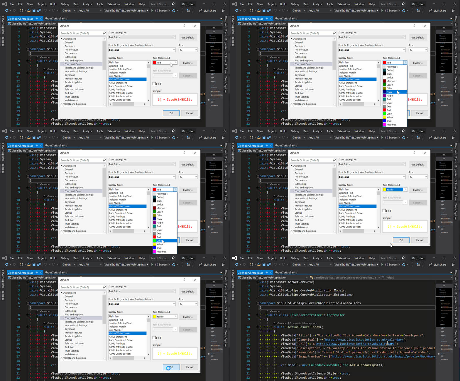
Change Whitespace Colour
You already know you can show whitespace, however I find that the default styling used to show it is a bit too subtle. Especially in the dark theme.
If you are the kind of person who whats to view whitespace, you're probably going to want to change the colour of it.
I've tried yellow, but it seemed a bit too overpowering.
Personally, I find orange to be a perfect colour for showing whitespace when using the dark theme.

Other tips
| Bookmarks | Change Whitespace Colour | Code Map | Code Snippets | Comment Shortcut | Dark Theme | Delete All Breakpoints | Expand/Collapse All | Format Document | Full Screen | Go To Definition | Go To Line Number | Go To Matching Bracket | Go To MVC View | Incremental Search | Make Uppercase | Move Solution Explorer | Move Type To New File | Multiple Line Edit | Navigate Forward and Backward | Navigate Through Active Windows | Peek Definition | Pending Changes Filter | Preview Selected Items | Quick Actions | Rename Field | Scroll Wheel Font Size | Search Solution Explorer | Show Whitespace | Split Window | Sync With Active Document | Task List |


